Symbol
City symbol
The green mountain image symbolizes Chiaksan Mountain, the best-known natural landmark of Wonju,
and the three peaks represent Birobong, Hyangnobong and Namdaebong Peaks of the mountain.
The three blue ovals that gradually increase at the bottom express the unity, harmony and advancement of Wonju citizens.
Overall, this symbol represents the clean and beautiful mountains and rivers of Wonju and
the progressive spirit of Wonju citizens who are leading the city's globalization.
City brand slogan
In "Healthy Wonju”, the city brand slogan of Wonju, "healthy” does not simply mean physical
health but a status where healthy mind, body and society are harmonized.
The dynamic human image expressed with the letter "H” (Energetic/ lively) on a green land (well-being/ happy life)
matched with a font giving off a free-spirited impression is combined with the warm sunlight image
(hope/ dream and hope for the future). The sunlight, pouring down on the entire slogan, represents
the harmony among all the administrative districts of Wonju (1 eup, 8 myeon and 16 dong).
The logo, with this active and positive image far from stereotyped city images,
induce citizens to feel an affinity with their city and unite with each other.
It is a new symbol of a dynamic, vibrant and progressive Wonju as a healthy city,
serving as a means of communication within its citizens.
Dynamic Wonju
The Dynamic Wonju logo represents the identity of Wonju developing into a new and enterprising city; a dynamic,
audacious, vigorous, energetic city full of hope; a thriving city; and a green city. With the word "dynamic”
marked in bold, the logo also emphasizes the exciting, lively, and progressive image of Wonju.
The harmony of blue and light green symbolizes a clean, eco-friendly, green city, along with future education and welfare.
Healthy City CI
The Healthy City logo was designed in line with the logo concept of the Alliance Healthy Cities initiated by WHO.
A healthy city is a city where all members live an active and energetic life in harmony with their community.
The logo, by combining building (city) and dynamic human images over lushly green leaves (nature/earth),
represents Wonju as a city of unity. The logo also visualizes warm sunlight shining on all these healthy components of the city.
Safe Community CI

The Safe Community logo was designed based on the initials of each word, “S” and “C”.
While embodying the concept of “safety” and “community” with “S” and “C”,
the logo also uses the motif of a cross that symbolizes priority on safety to highlight the images related to safety.
The green color of “S” symbolizes the energy of Chiaksan Mountain, which has been regarded as the guardian of Wonju,
and the blue color of “C” is symbolic of a healthy and clean image of
Wonju with an advanced medical device industrial complex.
City tree: Ginkgo tree
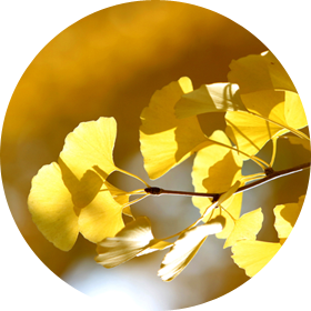
Ginkgo trees, with a long lifespan, were an object of traditional tree worship in Korea.
Their green summer leaves and yellow and red autumn leaves represent unity and
harmony and their magnificent shape and longevity symbolize eternal advancement.
City flower : Rose
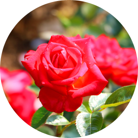
Roses, which bloom and boast beauty throughout the year, symbolize the patience of the citizens of Wonju. Diverse in colors and varieties, they are also symbolic of the endless wisdom of the citizens, with their sweet fragrance represent their elegant and noble spirit. The thorns on the stems are a symbol of the citizens' courage to resist injustice.
City bird : Pheasant
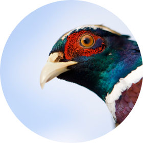
The pheasant represents noble dignity and infinite wisdom. With strong adaptability to any type of environments, the bird symbolizes great patience. Their long tail is a symbol of endless progress.